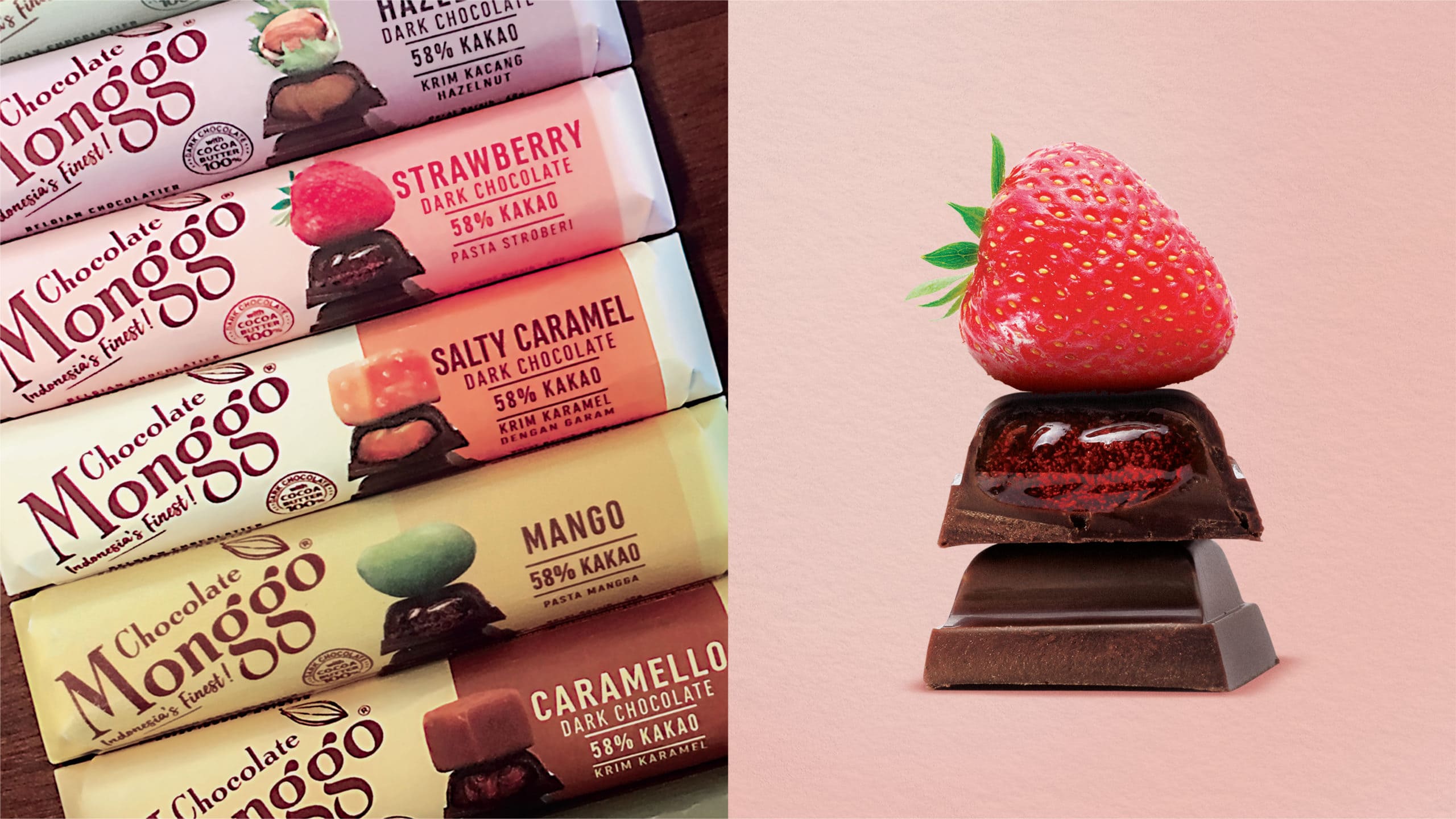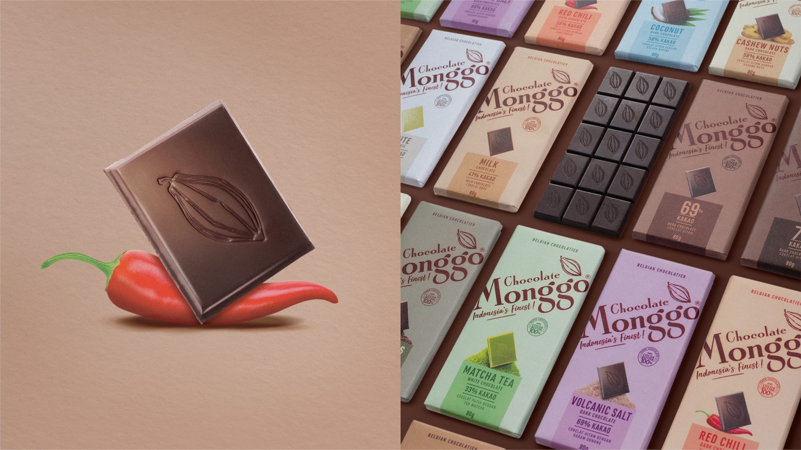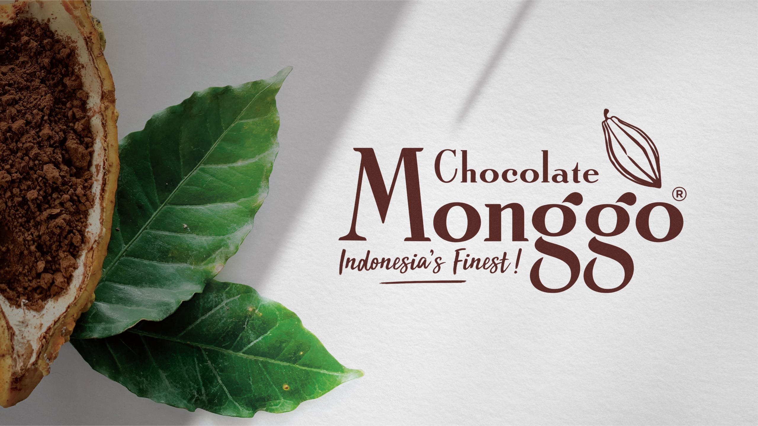
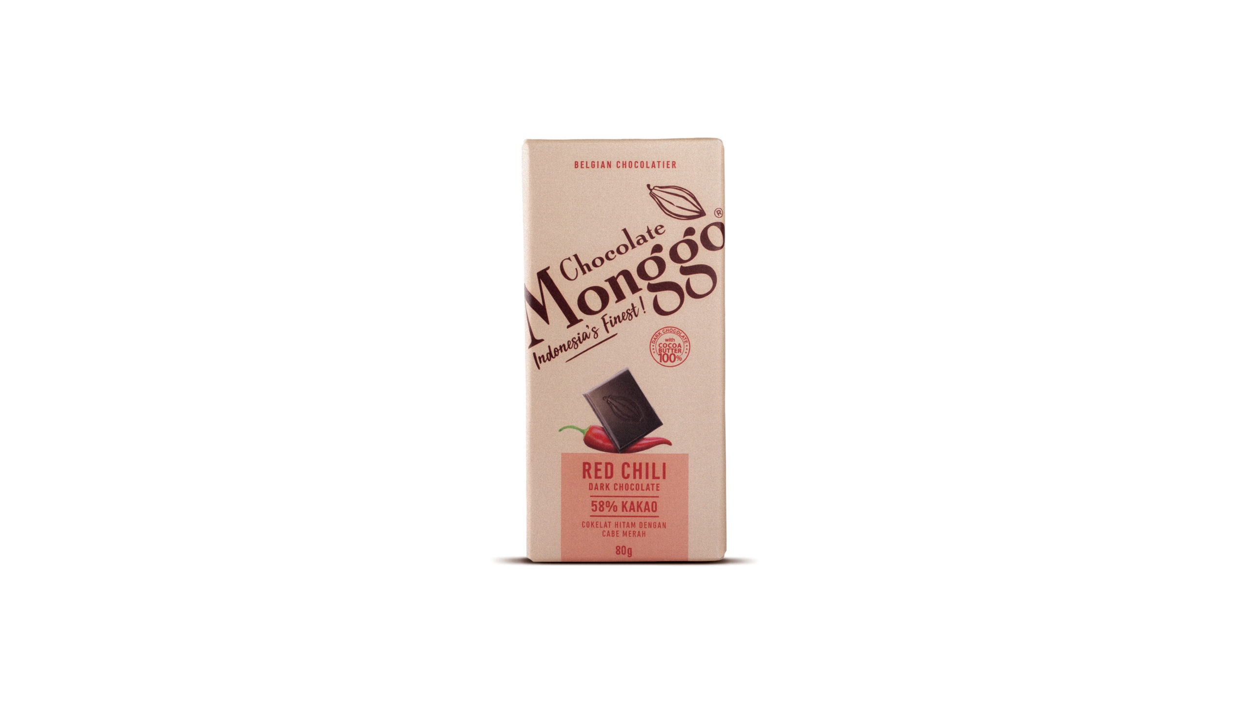
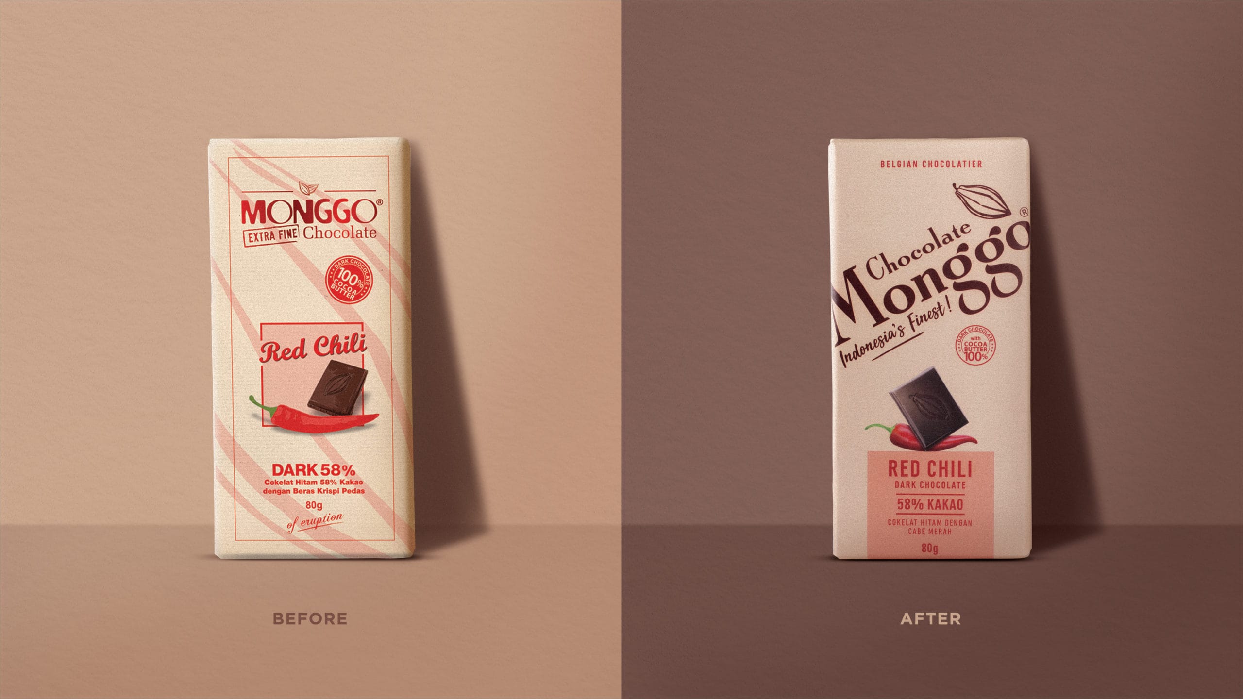
A total revolutionary redesign of Chocoloate Monggo’s branding and packaging – from logo and font-types to label structure which more effectively utilizes eye-tracking fundamentals. We focused our efforts on first simplifying Monggo’s logo (which would render better across digital channels like e-commerce and social media), and then vividly illustrating what sets its chocolates above the others – high quality ingredients and innovative flavors.
We injected a big dose of color branding and stronger visuals to appeal to a larger number of consumers (both domestic and international) who need to quickly identify the brand’s premium product qualities to encourage trial and (in the best case scenario) switch to Chocolate Monggo as their preferred chocolate brand.