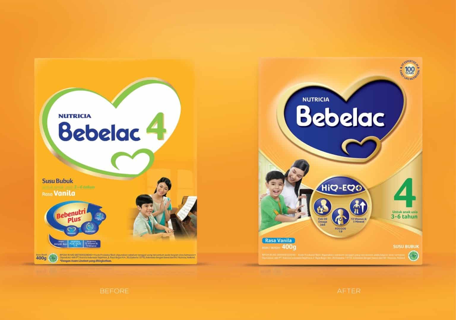
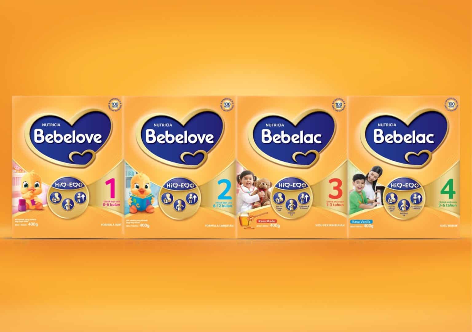
A new brand architecture with a revised logotype and color branding that efficiently communicates what the product’s value is all about whilst dominating attention at the shelf. The implementation of linear structuring grabs attention on-shelf and allows for easy reading and comprehension for better informed millennial parents.
Our Big Idea
Nutricia’s Bebelac brand focuses on infant nutrition that comes with love. Bebelac’s new and improved formula to support child growth provided an opportunity to re-present the value and efficacy of its brand to mums and dads.